Many navigation redesigns start with a sitemap and end with arguments about labels. Here’s what I do instead.
When I start a new complex navigation project, the first thing I do is close Figma and pull out my notebook. I spend a week just watching. Analytics, session recordings, support tickets, whatever I can get my hands on. I want to know where people get lost, what they’re actually trying to do, and whether the current navigation is failing them or they just don’t know the product well enough. If users can’t find something that exists, that’s a navigation problem. If they don’t know it exists at all, that’s an onboarding problem. Navigation can’t fix that.
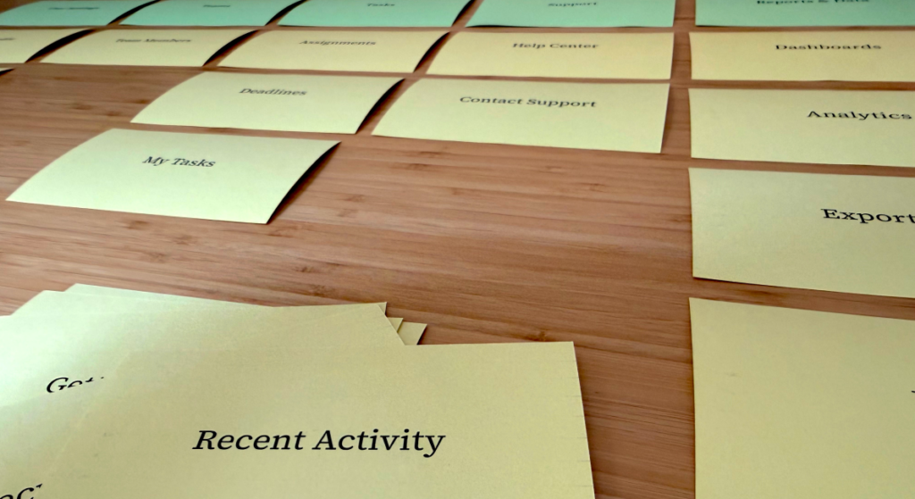
Then I do a card sort. Not because it’s a box to check, but because it forces real users to show me their mental model. When I review the results, the groupings become my starting point. But I pay just as much attention to where users disagreed. Those gaps tell me where the real design decisions live. That output becomes my north star.
From there I sketch. Multiple directions, not one polished concept I’ve already committed to.
Then comes the part many teams skip: tree testing. Before any visual design, before any prototypes, I validate the structure with tasks. “Where would you go to do X?” If people can’t find it in a bare text hierarchy, a beautiful dropdown won’t save it.
Only after tree testing do I bring in stakeholders. By then I have a validated structure. Instead of everyone lobbying for their part of the product to be front and center, I’m walking them through something that’s already been tested with real users. It becomes an education exercise, not a negotiation.
Then I move into Figma. By then, most of the big structural decisions are already made. The design work is about interaction patterns, states, responsiveness, and edge cases. Not “where does this go?”
A few things I’ve learned the hard way
Navigation is never just about findability. It communicates how the product thinks about itself. When navigation is confusing, it’s usually because the product has identity confusion. Navigation can’t fix that. At that point my job is to name the problem clearly and bring in senior or executive leadership. That question isn’t a design decision. It’s a business decision.
Stakeholders will want to solve navigation problems with labels. Labels are almost never the real problem. Usually the structure is wrong, the groupings don’t match how users actually think about their work, or the navigation reflects how the product was built rather than how people use it. Renaming things is easier than fixing the architecture, which is probably why it’s the first thing people reach for.
If you’re inheriting a navigation system that’s grown organically over 5 years, expect it to take 3× longer than you think. The real work is untangling the business logic baked into the structure, not designing the UI.
The Figma file is the last thing I make. That’s what makes it good.