The first time I shipped a product in 7 languages, I thought we were prepared. We had a solid design system. Clean components. Good documentation.
Then German happened. Followed closely by French and Spanish. Strings were truncating across the UI in ways we hadn’t caught in QA.
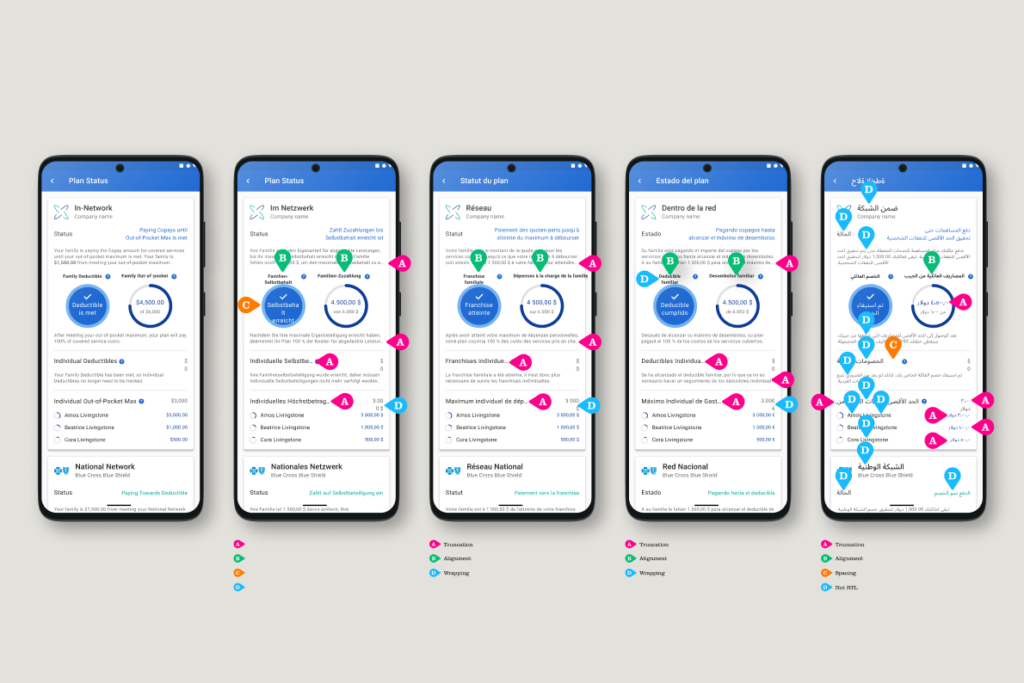
Then Arabic arrived. The truncation was bad enough. But we’d also never accounted for right to left languages (RTL), so entire layouts were breaking in ways that made the app difficult to understand.
This wasn’t a gaming app. It connected users to essential services. The failures had real consequences for real people.
We recovered. But the damage to user trust isn’t something you just patch in the next sprint.
Here’s what I wish someone had told us before we shipped:
01
Set your component minimum widths using your longest known translation, not the language you design in. Even if you don’t plan to translate into them, use a translation app to see how your strings expand in German or Finnish early in your process. Build to that. You’ll stop chasing button fixes in every sprint.
02
Run pseudo-localization early in both the design and QA processes. Pseudo-localization artificially stretches your strings to simulate text expansion before real translations exist. When you’re ready to validate with real languages, tools like Figma’s AI translation feature (or Google Translate) make that easy too.
03
Build RTL into your token structure from day one. Not as a separate theme. Not as overrides. Define directional tokens that map to logical CSS properties: padding-inline-start does the work instead of padding-left. Doing this late means rebuilding half your spacing logic.
04
Flag or fix culturally dependent icons in your component library. At a minimum, flag the problematic icons with “review before use in non-Western markets.” A thumbs up, a checkmark inside a circle, a red color for errors: none of these are universal. Naming the assumption is faster than pretending it doesn’t exist.
05
Icons need more than a cultural review. They also need directional variants. If you design through the lens of a left to right language (LTR), a send icon made up of an arrow pointing right makes sense: the content is moving forward, away from you. But in an RTL UI, that same arrow points back into the screen. The metaphor breaks.
06
Design your density scale with at least 2 settings. Compact and default. East Asian markets often expect more information per screen. If your system only has 1 density setting, you’ll be revisiting it the moment you add East Asian language support. Doing it upfront is faster than retrofitting it later.
None of this is complicated. It’s just asking the right questions 6 months earlier than feels necessary. The systems I’ve seen fall apart globally weren’t poorly designed. They were designed without curiosity about who else would use them.
I’ve seen this go wrong more times than I can count, including on my own teams. What’s the internationalization problem that caught your team off guard?