Usability testing with disabled users broke every assumption I had. Not in a dramatic way. In the quiet, embarrassing way where you watch someone struggle with something you were proud of and realize you built it for yourself. I had done the checklists. Color contrast, touch targets, focus order. The design-side audit came back clean. I genuinely thought we were in good shape.
Then we ran sessions with actual users.
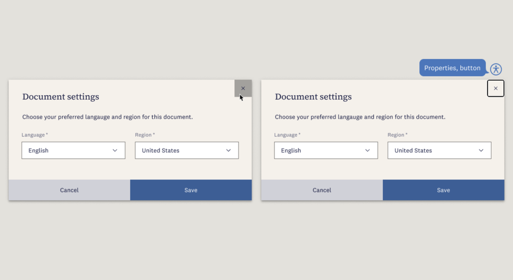
A screen reader user hit a modal we built and got completely trapped. We had reviewed the focus management. We’d tested keyboard navigation. Everything seemed fine. But we weren’t testing with an actual screen reader. The close button was an X icon. Visually, that’s unambiguous. But the accessible name on that button said “Properties.” A keyboard tester would never know that, so it wasn’t caught in testing. When a screen reader user heard “Properties,” she had no reason to think that button would close the modal. She kept looking for a way out, and eventually had to refresh the page.
That session changed how I work. A few things shifted permanently:
I added accessibility checkpoints to our design reviews. Not at the end of the project. At every stage. Wireframes, prototypes, before handoff. It became part of how we evaluated work, not a final gate.
I started running short sessions with assistive technology users earlier in the process. Not full usability studies. Sometimes just 1 or 2 people against a staging build, before anything shipped to production. That’s where the real gaps showed up.
I worked with our PM to make accessibility requirements testable conditions for done. Not a comment in a spec. Not a best-effort note. An actual definition of done that engineering could verify before a feature shipped.
Every change we made for accessibility made the product better for everyone. Clearer labels. More predictable interactions. Better error states. It was never a tradeoff.
If you haven’t run sessions with assistive technology users, start small. Recruit 2 or 3 people through your network or a screener. Run 30-minute sessions. You don’t need a research ops team or a lab. You just need to watch someone use your product.
Have you ever watched a screen reader user navigate something you built? I’d love to hear what changed for you.